A Question of Dominance
The Figure/Ground Law in Graphic Narrative and Visual Storytelling
If we see an image, we immediately try to separate the foreground from the background. This can create an exciting dynamic and make the attention shift from front to back and back. The most famous example of this principle is the image of the two faces, or was it the vase….
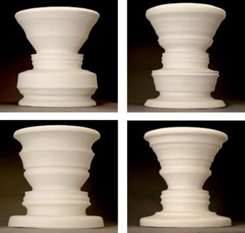
Gerard Lange, Gestalt Vessels (date unknown)
Dutch graphic artist M.C. Escher (1898-1972) was fond of this mind boggling method. He made mathematically-inspired works adding an extra layer of meaning with this visual playfulness.
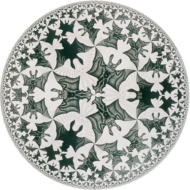
M.C. Escher
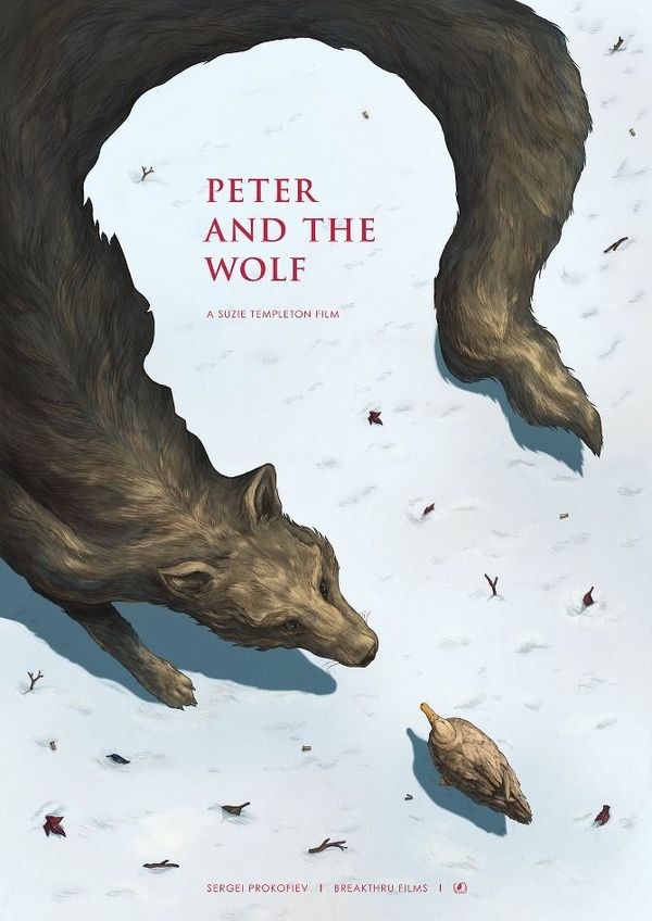
Phoebe Morris, Peter and the Wolf (2014) film poster
This foreground background play has a tendency to become a gimmick. A good one if it’s well done but it can be used more subtle, less literary. It doesn’t have to include the perfectly matching positive and negative shapes. This figure/ground law is not about matching shapes, it is about the question of dominance between fore- and background.
To establish this tipping scale feeling the shapes don’t have to match up exactly but the composition has to be perfectly balanced. Meaningful use of positive and negative forms can flip your perception but contrast is another great way to establish a tension between two areas in a composition.
The fashion illustrator, René Gruau (2009-2004) whose style has had a lasting effect on the fashion industry made a perfect example of this principle. A lady almost obscured by the man flocking around her nevertheless steals the show. Her bright yellow dress dominant attracting attention like a beacon between the dark smocking’s in the foreground.
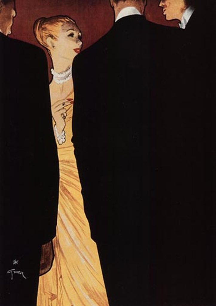
René Gruau, fashion illustration
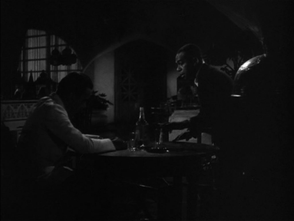
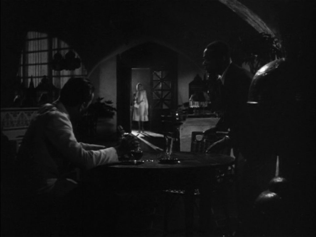
Michael Curtiz, Casablanca (1942)
In the ‘40 and ‘50 of the previous century a film style we now refer to as Film Noir used a strong contrast and heavy shadows to set the stage and play with the focus of the audience. The use of light and shadows in these harsh black and white movies is brilliant, resulting in beautiful compositions and great story telling.
One of my favourite films of that era is Casablanca (1942) (US Link) by Michael Curtiz. It uses shading beautifully. In this scene Rick (Humphrey Bogart) and Sam (Dooley Wilson) wait for Ilsa (Ingrid Bergman) in a closed and dark cafe. The mood is grim… Then she steps in. Lightened by the lighthouse behind her, she manages to get all the attention to the background.
Alberto Breccia (1919-1993) and Frank Miller are two other comic artist who had a tremendous insight in the power of contrast. Their deliberate use of both the black and the white gives their work a layered depth that almost suggest movement by shifting balance.
Breccia’s Mort Cinder (1962-1964) (US Link) created in collaboration with Héctor Germán Oesterheld “made extensive use of dramatic lighting effects reminiscent of film noir to achieve a remarkable psychological insight”. He succeeds in giving his drawings depth by distinguishing foreground and background in high contrast without making one dominant. Establishing a tension and in the case of Mort Cinder, a horror tale, a constant threat.
In the neo-noir world of Frank Millers Sin City series (1991-2000) (US Link) black and white are the main colours establishing a harsh contrast. Red, yellow, blue, and pink, are used sparingly in some stories to draw attention to particular characters. Shadows play an important role. They seem to have a life of their own, now longer in the background but in turn taking the stage.
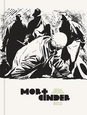
Alberto Breccia, Mort Cinder (1962)
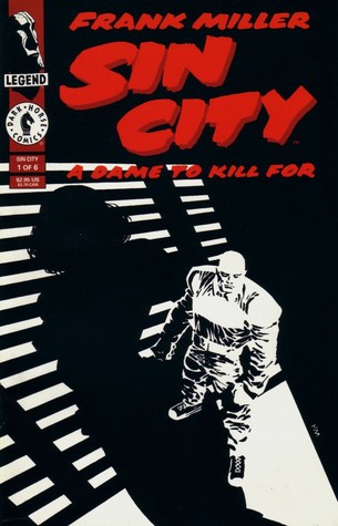
Frank Miller, Sin City (1994) A Dame to Kill For
Adding actual movement to such a well planned composition can have great narrative impact. The meaning of a mystic moment in the movie Embrace of the Serpent (2015) by Ciro Geurra is enhanced by what the two lead characters are placed around a campfire; a scientist in plain sight, the a shaman in shadows. The scientist is looking for all kinds of things; a plant, experiences, answers. The shaman says he can’t help him; he forgot. But he’ll tangle along. The scientist (based on the scientist Richard Evans Schultes) wants to try some sacred drug that should help him see. But Karamakate, the Amazonian shaman says it is of no use. He needs to learn to listen to more then his ears first… It is the scientists journey. The shaman can’t help him, the scientist is on his own (like we all are). The little puffs of smoke from the campfire help in shifting the focus as it does in the narrative. The shaman is the director, he pretends not to know what he’s doing but he dominates at the right moments, leading the way.
Thanks for visiting 🙂
Please let me know if you have some other great examples where this technique is used!
This is the sixth in a series posts or articles on Gestalt and Visual search tips and tricks for visual storytelling and graphic communication in my get-into-details research.
If you think you’ve got these you might want to check out the upcoming series on priming, details in composition and their effects on the main story ingredients; character setting and plot.
Curious on why I got into this topic check out my earlier post or articles:
Readers tips and darlings I couldn’t cope to kill:
Italian illustrator and comics author Sergio Toppi (1931-2012) is a master at finding the a perfect balance composition. Using the white of the page as means to contrast his detailed darker parts. By giving the white spaces a well defined meaningful shape they can not be ignored (as we are accustomed to do). In some cases he uses the positive/negative shape play to enhance the tipping-point feeling.
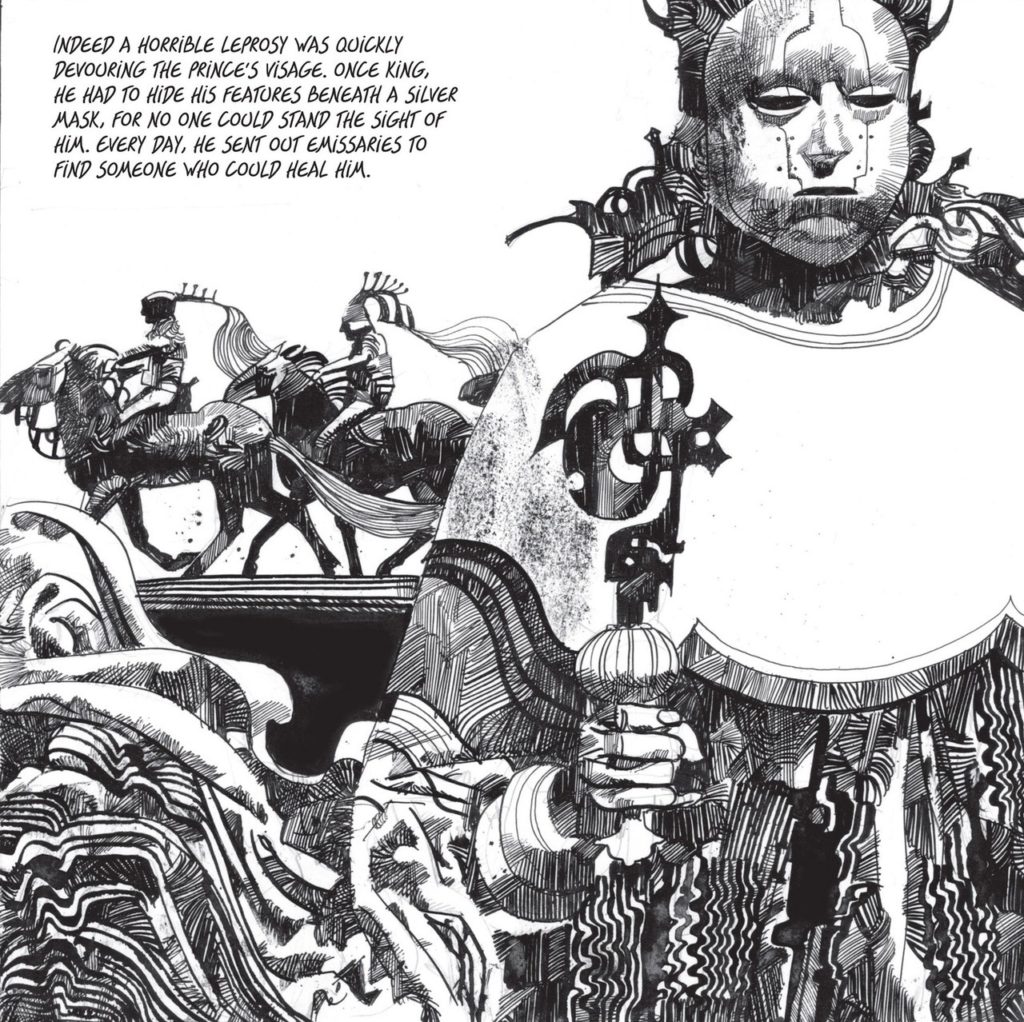
Sergio Toppi (date unknow)
