Cutting Edge Editing for some Piece of Mind
The Laws of Closure, the Filled Gap and Continuity
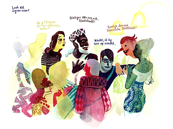
Brecht Evens, Wrong Place (2010) Used with kind permission
This Gestalt principle is often divided into 3 laws: the Law of Closure, the Law of the Filled Gap and the Law of Continuity. They derive from one phenomenon: continuous and closed figures or predictable sequences and patterns are seen as a unit. It helps make sense out of complicated scenes. We know that if something obscures our view what it doesn’t really intersect with what’s behind. People don’t loose a limb if someone stand in front of them en or their eyes if they are coved with shade. Brecht Evens uses this phenomenon to illustrate a crowed scene in his beautiful book Ergens Waar Je Niet Wil Zijn translated as Wrong Place (2010) (US Link) (Soon to be followed up by a new book: Het Amusement (2018) to be translated in 2019 as The City of Belgium)
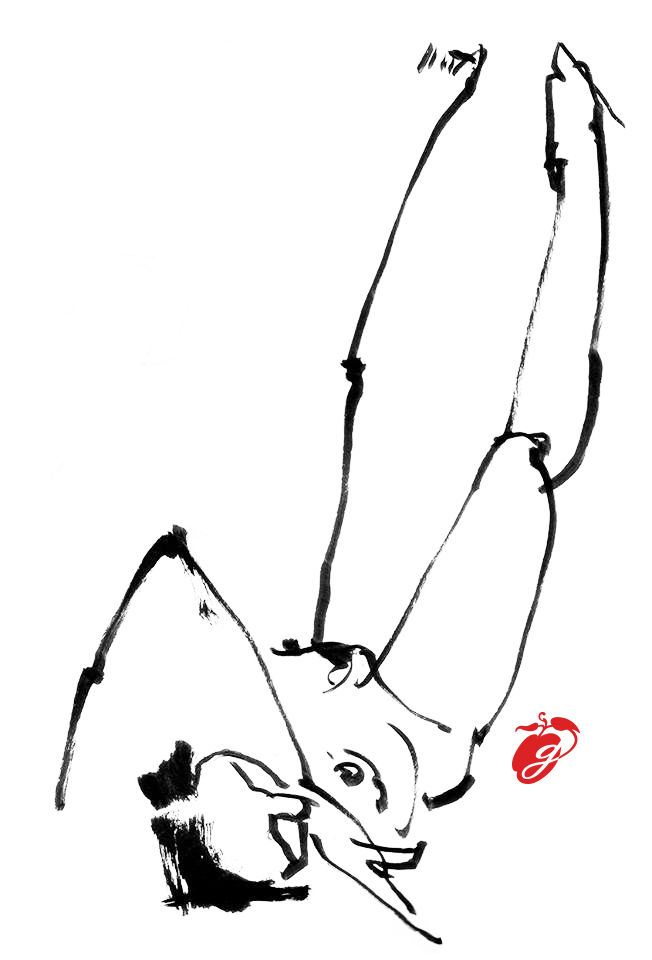
Gemma Plum, Nude (2007)
Our mind uses logic and experience to understand what it is looking at. It connect lines and parts that belong together (or seem to belong) together. As is shown in the little nude drawing, our minds fill in the blanks and it can even fill gaps and finish images if information is missing. It connects the dots…
The human brain is looking for unity and meaning by completing structures. The eye wants to finish things and falls silent on interruptions. Taking a moment to decide how to follow along. This is a great method to have the eye pause on something.
An element that breaks through this connection attracts attention. Nicolas Nemiri uses that in a brilliant way in this drawing of a ‘casual’ lady. Guiding the eye to what she is covering up, but presents to us never the less.
In single image narrative this is quite a literary ordeal. The context will tell if there really a division of something that once was a whole or if it’s just a matter of blocked view. Either way the ‘cut’ will attract the eye working as a speed bump for the mind.
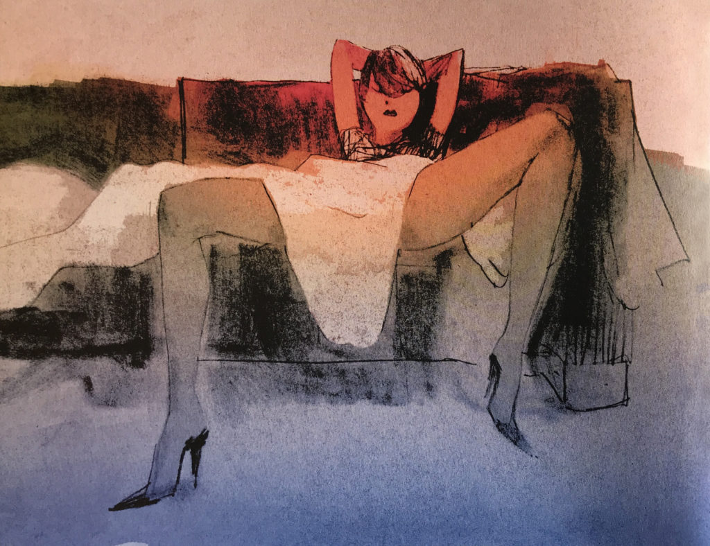
Nicolas Nemeri, Nemeri Book (2017) Used with kind Permission
To many speed bumps will confuse or give a very unsettling feeling. There is no time for the brain to settle, taking the viewer on a roller coaster ride. This effect can be put to brilliant use.
In Requiem for a Dream (2000) by Darren Aronofsky a quick-cut technique is used to illustrate how drug addiction feels. An average movie has about 600 to 700 cuts. Requiem for a Dream has about 2000 cuts. Mr. Nerdista explains in his video essay how Editor Jay Rabinowitz uses repetition and fast pace editing (hip-hop-editing) in a strong narrative way.
City of God (2002) by Fernando Meirelles and Kàtia Lund editor Daniel Rezende uses the same technique. Not to illustrate the chaos of the mind but the chaos of a city. The openings scene gives a perfect introduction to the ‘feel’ of the city. An establishing shot that not only gives you an understanding of setting of the movie but gets there on an emotional level.
Darren Aronofsky, Requiem for a dream (2000) (Edited by Jay Rabinowitz)
Video essay by Mr. Nerdista
Fernando Meirelles And Kátia Lund, City of God (2002) (Edited by Daniel Rezende)
There are many different cutting and editing techniques. A few of which can be linked to these Gestalt Laws where an interruption in the expected flow demands attention. Both insert shot or cut away add a fragment to a sequence.
A cut away is an inserted clip from another en environment. It can be used to show what is going in somewhere else, as some sort of flashback, attention shift or to indication of the mental state of someone as we saw in the example from Requiem for a Dream. The insert is a fragment from the immediate surroundings.
In this school example 🙂 clip from Ferris Beuller’s day off (1986) directed by John Hughes we see both a cutaway and an insert shot. The cut away servers to show what is happening at the same time somewhere else (Ferris, very healthy, having and directing some phone calls). The insert of the blinking lights on the phone in Rooney’s phone call serves as an exclamation mark on the horrific ‘thruth’ principal Rooney just had.
Japanese director Yasujiro Ozu (1903-1963) was famous for adding this sort of atmospheric moments (and he inspired many great modern directors among which Wes Anderson). Ozu films are very stylized and he’d use cut-aways and inserts focussing on seemingly meaningless things or landscapes for several seconds (which in film terms is L-O-N-G).
In his book To the Distant Observer: Form and Meaning in Japanese Cinema (US Link) (extract here) film critic Noël Burch gave them ’with some hesitation’ the name pillow-shot. A term based on Makurakotoba (pillow-word) used in classic Japanese poetry. Figures of speech or metonymy commonly used to allude to something else.
Pillow shots can allude to something too, but that is not the only, or even the most, defining quality.
These ‘cut-away still lifes’, as Bursh calls them, ‘suspend the diegetic flow’. They interrupt the story. But “Far from diluting our emotional response, this intensifies it by giving us time to share the feelings unfolding on screen.” Time Out (UK) wrote in their Bluffers guide to the films of Ozu.
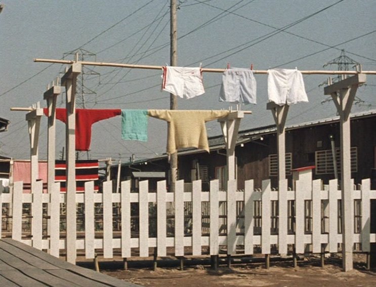
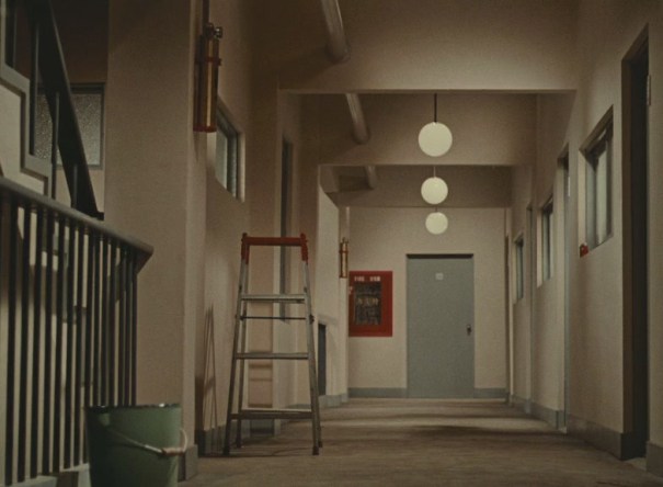
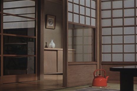
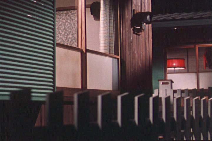
Pillow shots from Good Morning (1959) by Yasujiro Ozu
Mind the little red detail in all of them 🙂
In Studio Gibli al lot of these ‘emotional establishing shots’ are used to set the stage giving their narration some ‘air’ and the viewer time to absorb the atmosphere or situation. In an interview with Roger Ebert the director of Studio Ghiblis Spirited Away (2001) (US Link) Hayao Miyazaki talks about “gratuitous motion” in his films:
Roger Ebert: “instead of every movement being dictated by the story, sometimes people will just sit for a moment, or they will sigh, or look in a running stream, or do something extra, not to advance the story but only to give the sense of time and place and who they are.
“We have a word for that in Japanese,” he [Hayao Miyazaki] said. “It’s called ma. Emptiness. It’s there intentionally.”
Is that like the “pillow words” that separate phrases in Japanese poetry?
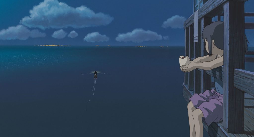
Pillow shots from Hayao Miyazaki’s Spirited Away (2001)
“I don’t think it’s like the pillow word.” He clapped his hands three or four times. “The time in between my clapping is ma. If you just have non-stop action with no breathing space at all, it’s just busyness, But if you take a moment, then the tension building in the film can grow into a wider dimension. If you just have constant tension […] all the time you just get numb.””
In comics or multi frame narratives the ‘flow’ of the story often is cut up into frames or panels. The space between the panels is in some degree ma or, at least, has ma potential. The gaps can serve as cuts and jump between scenes, but they can also be and need to be used to represent movement and the passing of time. We don’t read a comic as a slide show. We read it as a whole, a story. We perceive movement where there is only a ‘before’ and ‘after’ image. What happens in between is understood. In principle the fact that we can read and understand an event that has been cut up in frames is a perfect example of the Gestalt law of the Filled Gap.
Rodolphe Töpffer is believed to be the first to make multipanel comics (although, of course, through the ages artists have made plenty of multipanel paintings that represent some sort of story). He ‘cut’ his panels so that they made little jumps in time. We believe the artist in this comic turned his painting around. We don’t have to see it. We make a whole event from these four drawings. Except these little jump in time there is no interruption, out eye flows along the story gradually and without pause (or ma) without settling on anything in particular. (Which, of course, is absolutely fine and legitimate in the example shown.)
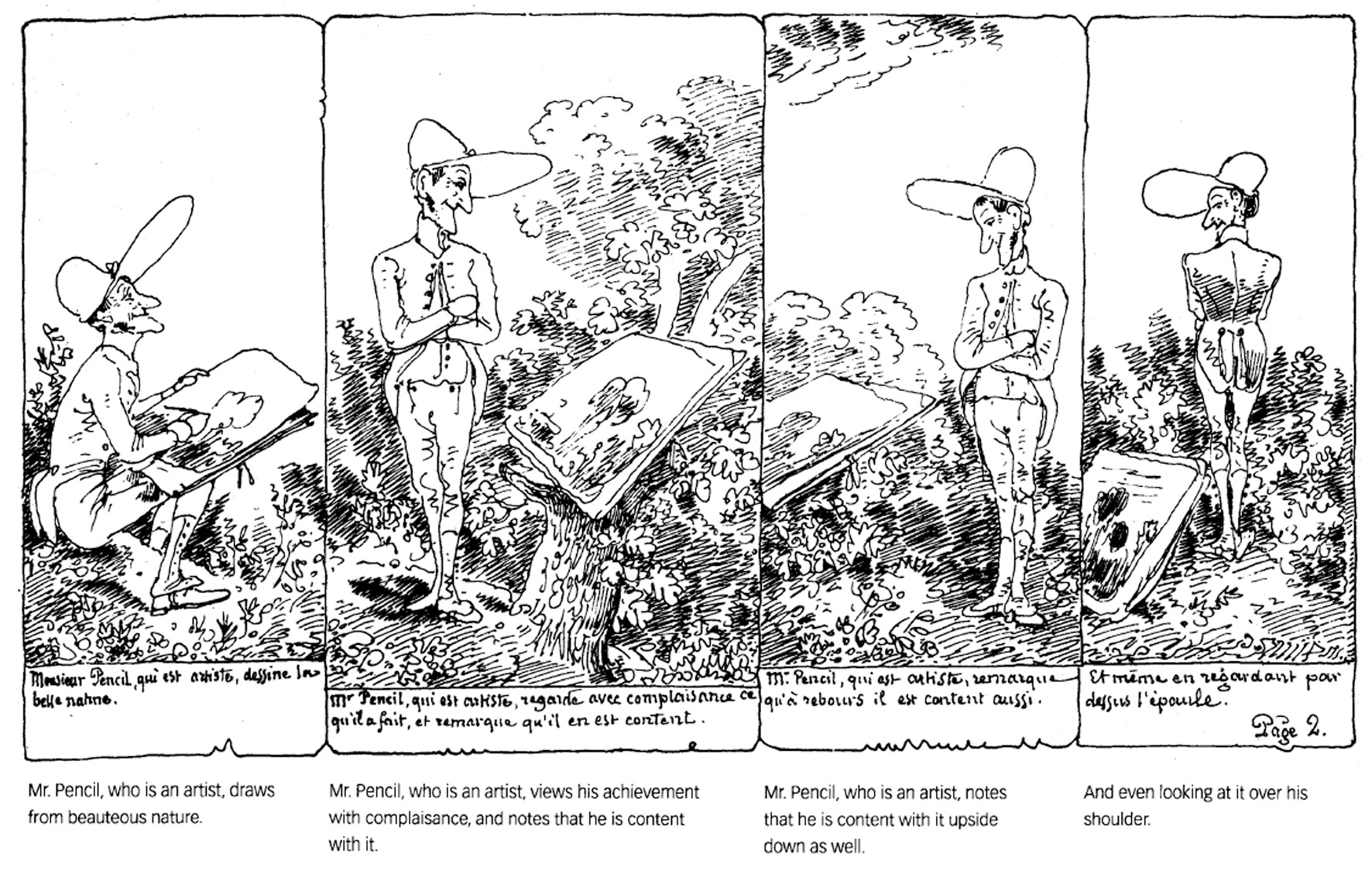
Rodolphe Töpffer, Mr. Pencil (1840)
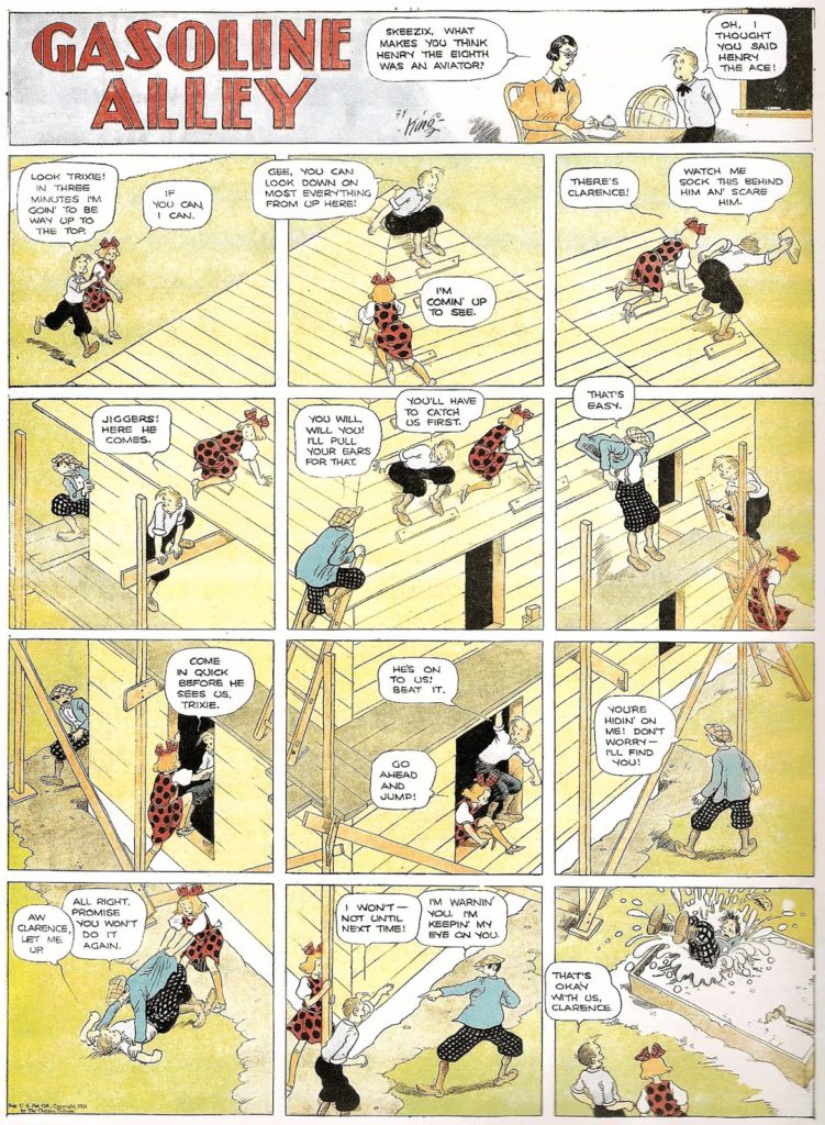
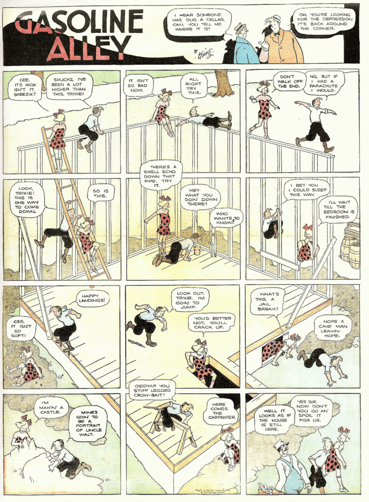
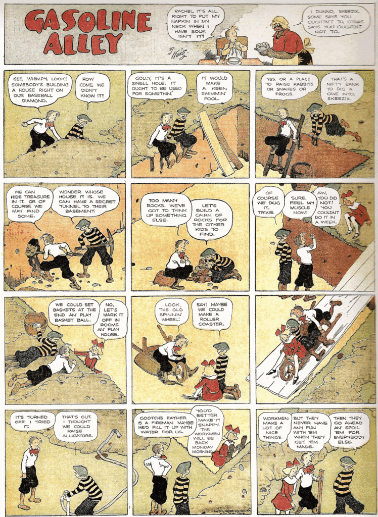
Frank King, Gasoline Alley
Multi frame narrative doesn’t have to be linear, like film is (or like hand clapping is). In this Gasoline Alley by Frank King (The Complete Sundays now collected in Volume 1 and Volume 2) we see a great and very special use of these frame divisions. He left the ‘big picture’ (pun intended) intact. Our brain switches between this ‘establishing shot’ and meaning of these little time leap gaps. A conflict arrives. Our brain wants to make the divided image back into a whole but understands the convention of the meaning of the division into frames. The frames serves their purpose; they tell us the passing of time played a part in what we perceived as a whole.
Of course comics can use insert ‘shot’ and cut always too. The flow of the story is interrupted. Something the give sense of space or the pacing of time. Sometimes to focus attention. To give a moment to recover, to settle, to contrast an upcoming event or give the story a scene of chaos. Manipulating the emotion of the reader.
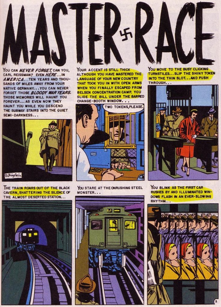
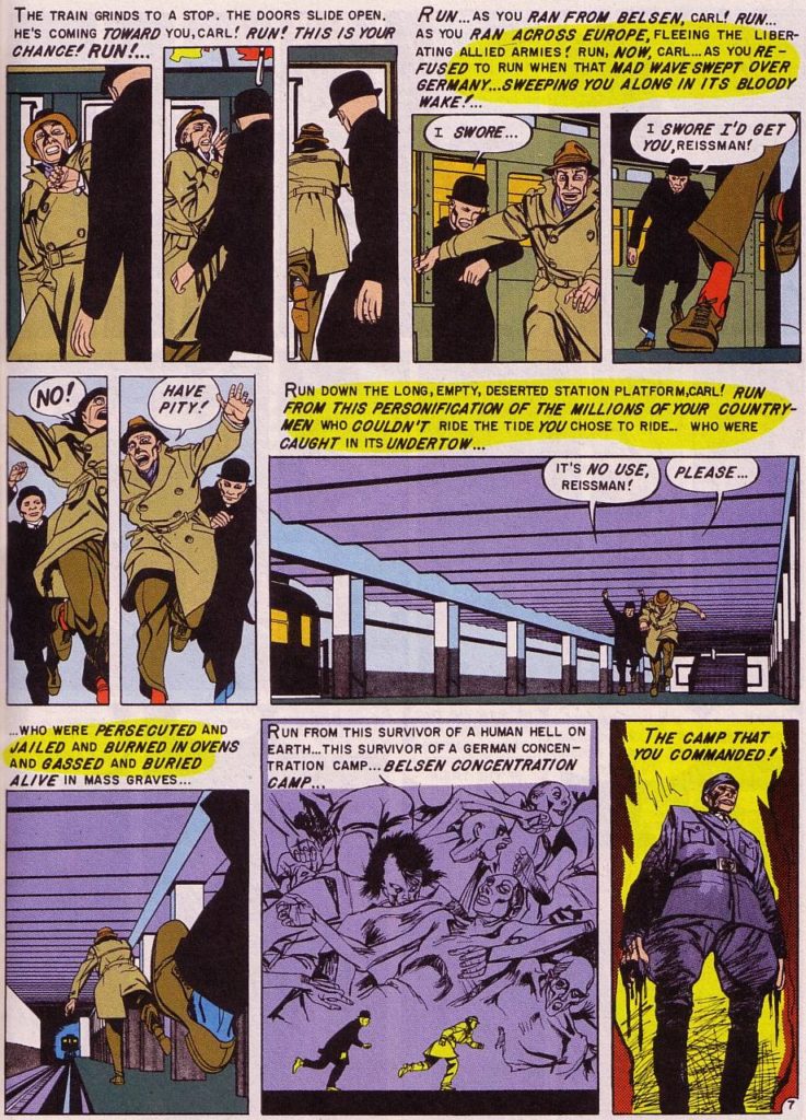
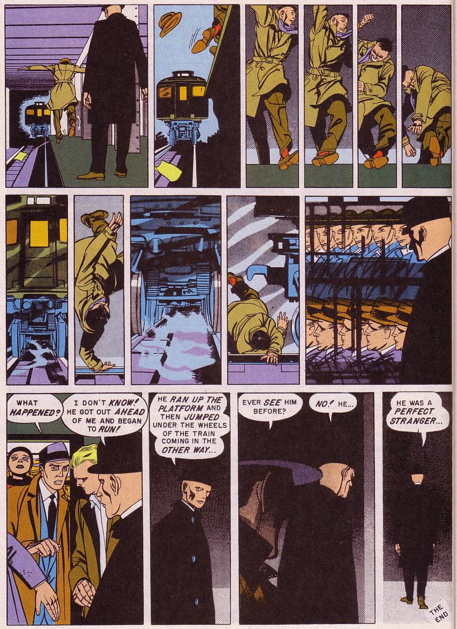
In the short story Master Race (1955) by Bernard Krigstein the pacing is brilliant. In the climax, the top right of the last page the upcoming train is intercut with Reisman falling, falling, in slow motion. Train, Reisman falling. The train is inevitable, the consequences for Reisman clear. He could have used two panels, a guy slipping and train hitting. But this is so much more powerful. The horrific moment drags out dragging in our emotions…
Our brain has no problem to understand the interrupted movement. Reismanns fall is perceived as a fluent motion and the oncoming train keeps on coming without pause. The white between the panels and all the missing ‘frames’ are filled in. Even the gaps made by the ‘other’ story don’t interrupt the narratives. The different panels are seen simultaneously, it is impossible to look at just one of the panels. The use in colour aids the affect of two stories coming together in a spectacular and dramatic way.
Please let me know if you have some other great examples where this technique is used!
In case you’re wondering about why I’ve asked Brecht Evans & Nicolas Nemiri for permission to use their work and none of the other artist; I’m using all artwork under the Fair Use Law, but decided to let all living artists (who are not presented by major bureaucratic agencies) know I appreciate their work and use a small part of it in this context on this blog.
If you think you’ve got these you might want to check out the upcoming series on priming, details in composition and their effects on the main story ingredients; character setting and plot.
Curious on why I got into this topic check out my earlier post or articles:
Readers Tips and a Revived Darling:
I would like to add one more example because it is a perfect example and completely bizarre. A ‘darling’ I could not quit let go. Enjoy:
John Landis, An American Werewolf in London (1981) (Edited by Malcolm Campbell)
