The Law of Symmetry
Two sides to a story
Mankind is very fond of symmetry. Something symmetrical is pleasing to the eye and associated with perfection. A symmetrical face is regarded as healthy and (therefore) beautiful.
And of course what is symmetrical we see as a whole. Obviously… We recognize parts of a vase or coffee mug if it’s scattered about a room and can glue a torn photo without getting puzzled too much.
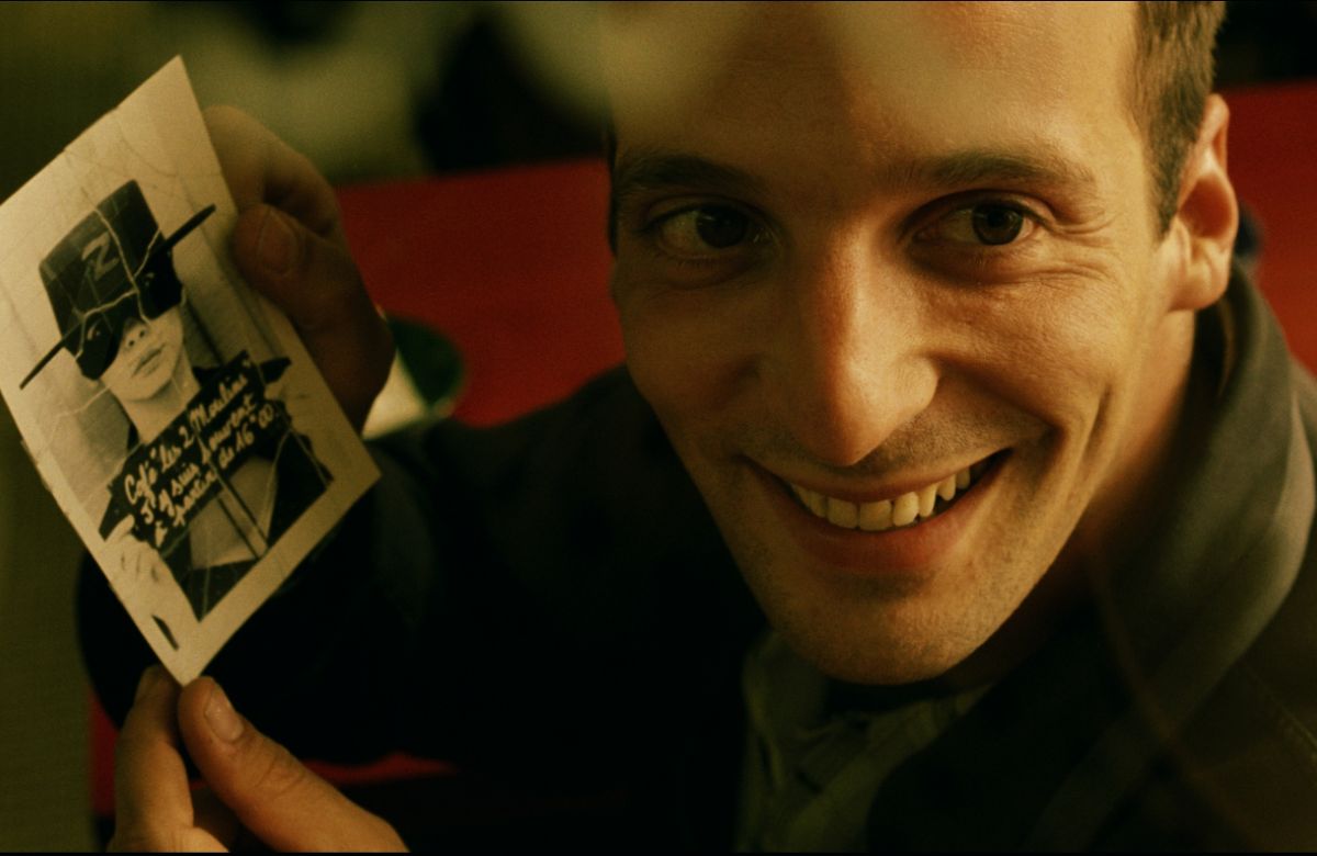
Jean-Pierre Jeunet, Le fabuleux destin d’Amélie Putain (2006)
It is easy to match symmetrical, pieces and see a bigger picture, even if the parts don’t quite match.
Both Jens Harder and Charles Burns use this masterfully in their work. Using our need to give what seems to belong together an all encompassing meaning.
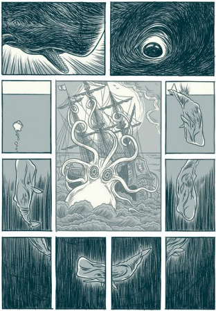
Jens Harder, Leviathan (2003)
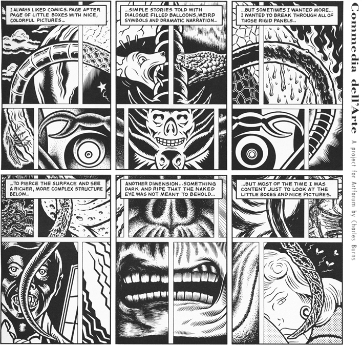
Charles Burns, Commedia dell’Arte (2011)
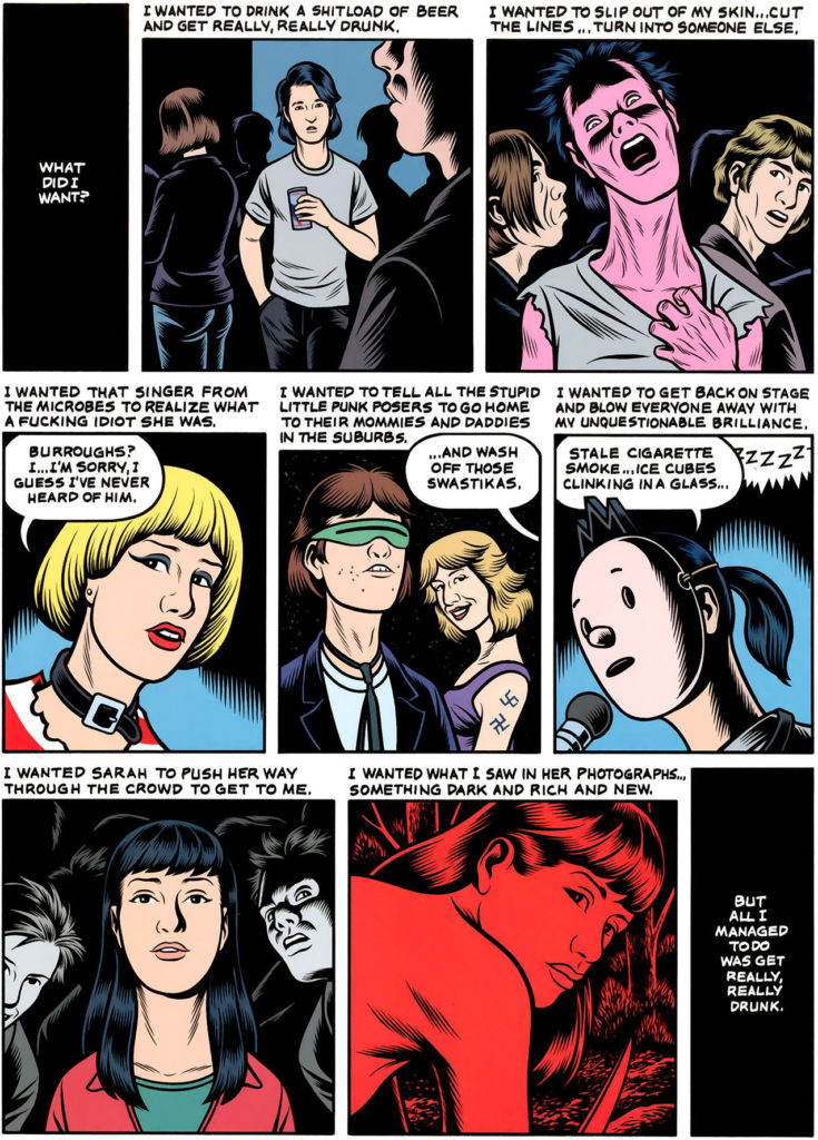
In Last Look (2016) Charles Burns uses symmetry to draw the eye and attention and give a sense of peace.
The feelings of Doug, the protagonist become clear by the rhythm and focus of the composition of the page which depicts a party. He is depicted (almost) top left centre of the frame in a medium shot. There are people in the foreground and in the background making the frame a-symmetrical. Doug is part of something lively, a party. Top right we see how he feels, awkward, hurting, nervous, alien, ugly. A closer view, his head’s askew.
On the opposite of de diagonal; in the bottom right frame we see the object of his attentions. Probably the first thing we saw too when looking at the page; Sarah.
She is similarly to his zombie-self-image top right, but see seems to come closer to the viewer; us and, more importantly, Doug. Her symmetrical peaceful framing (quite the opposite of his awkward self top right) gives her centre stage, she is a beacon in the rum-bum of the party. I can even imagine the party sound seeming to dim as she enters, the party, the frame and the page…
Charles Burns, Last Look (2016)
Movie directors Yasujirô Ozu, Wes Anderson and Stanley Kubrick (among others) use (among other things) a lot of symmetry in their work and they all know how to create a very individual – and very related – atmosphere.
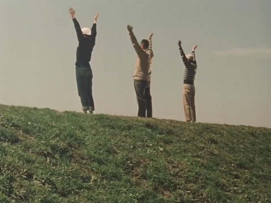
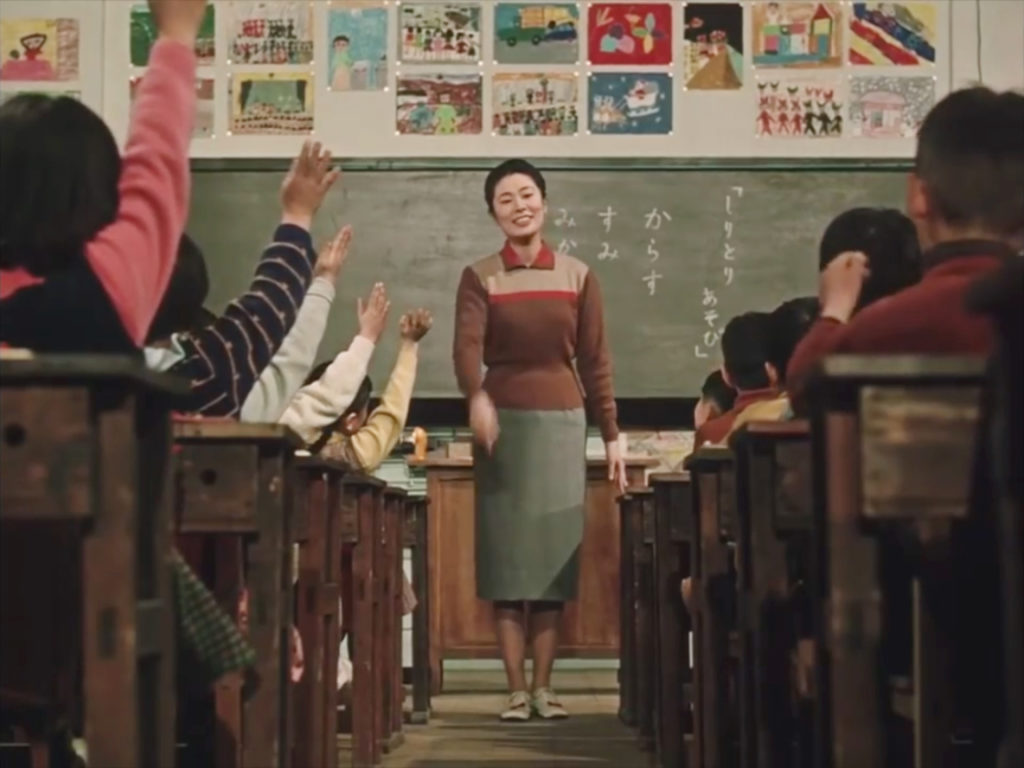
Yasujirō Ozu, Good Morning (1959)
Ozu uses symmetrical compositions to bring about peace and balance.
Wes Anderson knows how to create action from a symmetrical basis. He uses the serenity of symmetry as a contrast to the chaos of action.
Kogonada, Wes Anderson // Centered (2014)
Kubrick uses symmetry and a one-point perspective to build a tension.
The repeated focus on the long empty corridors in the empty hotel in The Shining (1980) creates a haunted feeling (emphasized by the fact that little Danny hesitates every time before entering). When Jack Torrance (Jack Nicholson) slowly loses his mind and becomes a predator. The chase in those corridors, never knowing what’s around the corner, illustrates and emphasises his hunter vision and state of mind.
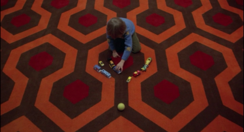
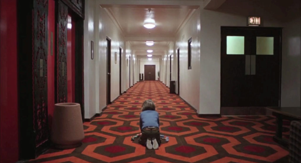
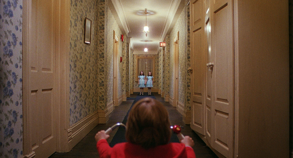
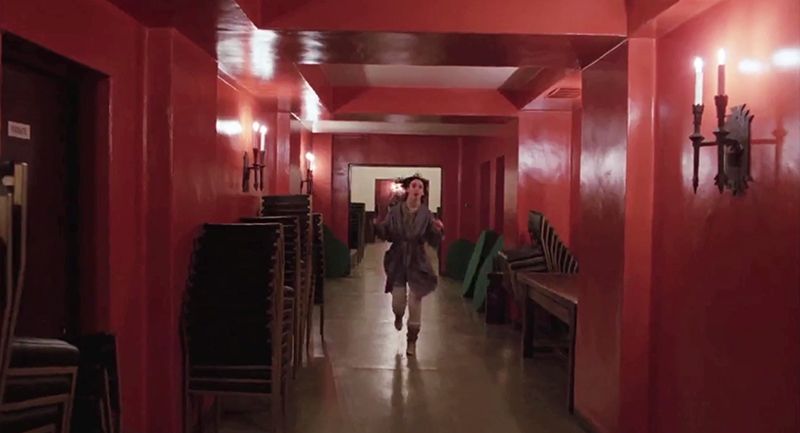
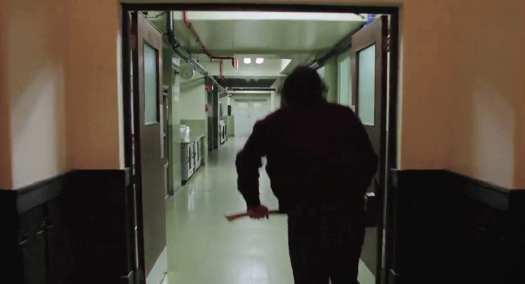
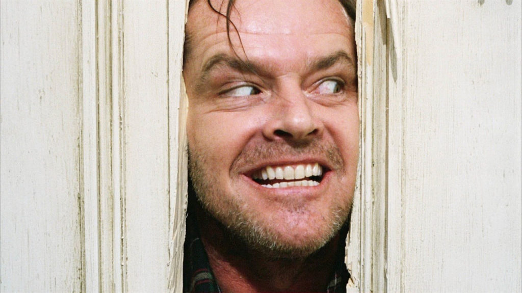
Stanley Kubrick,
The Shining (1980)
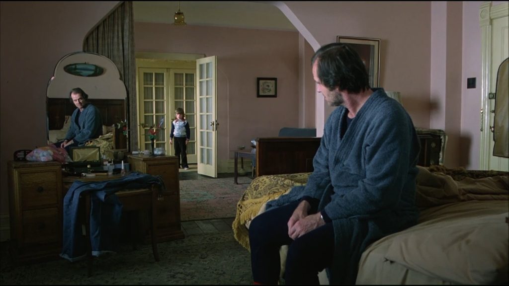
But Kubrick’s use of symmetry goes beyond just the exploitation of the pulling and threatening sense of endless tunnels. In this last frame he uses symmetry as a scale.
Jack’s son Danny (Danny Lloyd) enters his room. Standing in the background as a tiny lever between Jack (Jack Nicholson) and a mirror which reflects Jack’s image. Squashing Danny between Jack and ‘the reflection of Jack’, making his son the one that might tip the scale or a threaded victim of the struggle between these two Jacks; his father and his psychosis.
This knack for symmetry provides interesting narrative opportunities, especially if the balance normally associated with it, is off. The smallest deviation is quickly noticed. Adding a tension which can be used in many ways to aid your story.
As we’ve seen in the examples of the shining symmetrical compositions and (related) one point perspective lead the eye to the centre and provide a balanced image. The image becomes a scale with a tipping point, weighing each side.
Even if the two sides vary we see a symmetrical composition as a whole (Gestalt law of symmetry) and we feel a relationship between one side of the image and the other.
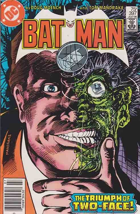
The two sides of the image can ‘weigh’ human values or ideas and symbolize a ‘before’ and ‘after’ or a ‘desirable’ and a ‘real’, a ‘good’ and ‘bad’.
Doug Moench & Tom Mandrake,
Batman Cover Batman 397 (July 1986)
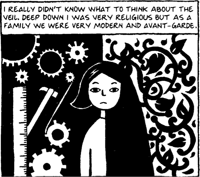
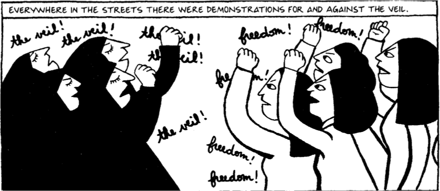
Marjane Satrapi, Persipolis (2000 & 2004)
Off balance symmetrical compositions tell a story. In Portugal (2011) by Cyril Pedrosa a bike parked just out of centre, disturbing the balance and symbolising a visitor disturbing the peace.
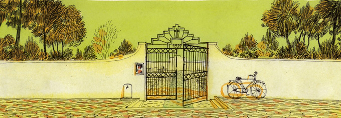
Cyril Pedrosa, Portugal (2011)
The story of this boy in the backseat is similar to the example from The Shining; one glance at this picture tells us he fears his mom and dad are drifting apart. They form two opposite sides. He is stuck in the middle. He is their common ground, he is what binds them while they’d rather be apart. He is the tipping point and the pressure is visible.
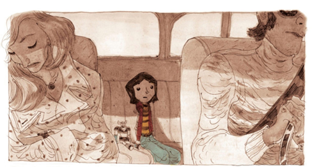
Cyril Pedrosa, Portugal (2011)
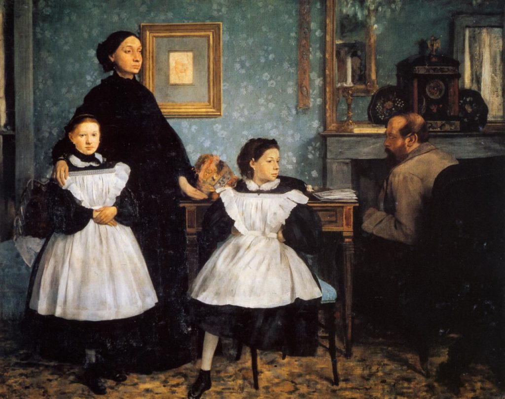
Edgar Degas, Family Portrait (ca. 1858-1867)
Degas uses this same sense of balance to tell a story in his ‘family portrait’. In the centre, the tipping point, again, a child. The tension between mom and dad is palpable. They form two sides, dad at his desk, turning his back to us (and maybe a bit to often to his family? A busy man?), his gaze on the girl. Mom looking in the distance, aloof but reaching for her, while her other daughter is kept at her side. The sense of visual balance helped by the dark clock at the seated fathers head to outweigh the mothers upright ‘presence’. The girl in the middle torn is between her parents, her feet aimed duty full at her mother her gaze not entirely toward her father but almost meeting his.
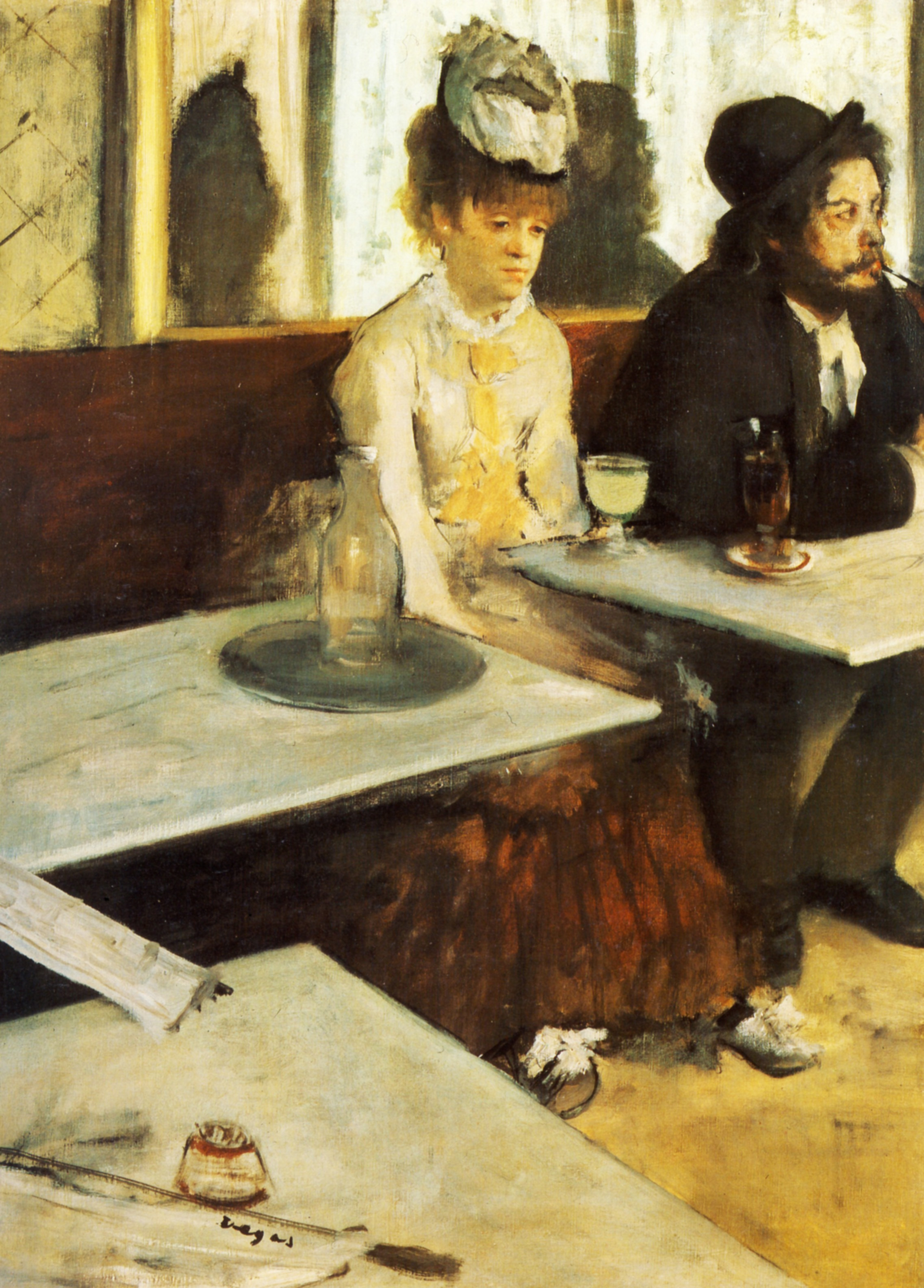
In ‘The Absinthe Drinker’ an absence is felt. The painting gives a sense of a gaping loneliness. The lady, just a little of centre, makes us compare the empty seat with the one filled on her left. A lady alone on a empty bench is not so lonely as this one. The emptiness taking over the weight by being just a bit bigger… Is that why she slipped into this drunken state? This life? Degas is a true master of composition.
Edgar Degas,
The Absinthe Drinker (ca. 1875-1876)
Moebius is a master in using this slightly offset balance. His (limited edition) screenprint Le Meilleur (1991) is a perfect example of how to set things in motion using just one frame.
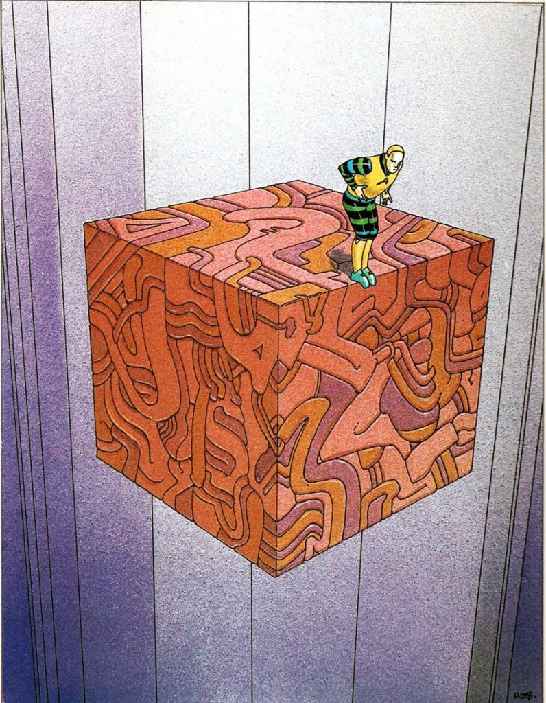
Jean Giraud / Moebius, Le Meilleur / The Best (1991)
With these examples I’ve concluded my blog-series on the The Gestalt Laws and have entered into the realm of composition. In next posts I’ll be covering several different aspects of the narrative powers of different visual structures or different approaches to mise en scène.
This is the sixth in a series posts or articles on Gestalt and Visual search tips and tricks for visual storytelling and graphic communication in my get-into-details research.
If you think you’ve got these you might want to check out the upcoming series on priming, details in composition and their effects on the main story ingredients; character setting and plot.
Curious on why I got into this topic check out my earlier post or articles: